Final Year Review

At the beginning of the final year of my degree I laid plans for the projects I would do over the following 8 months. These projects would tackle shortcomings in my skill set and would allow me to gain additional skills to further my progress in the creative industry. I selected these projects based on the results of Swot analysis and the projects I chose to work on would force me to tackle my weaknesses in social media self promotion and analytical skills, while utilising my strengths in digital and traditional illustration as well as my unique creative and problem solving techniques.

They would also open up new opportunities, through skill acquisition, within the creative industry.

The first project I tackled was competition based and revolved my ability to illustrate a character, as well as the ability to promote that illustration on social media. For this this I set myself the goal of increasing my follower count on instagram. This would force me to address my weaknesses in this area and turn it into a strength. Conducting the research into social media self promotion gave me a deeper insight into the methods and techniques needed to gain the follower numbers I desired.

This lead to me completely redesigning my instagram page into a streamlined and theme based platform and gave me the opportunity to produce a body of work that was both consistent and high quality. This content fed into my personal project work and I have been able to explore my  interests in futurism, technology and the coming singularity more fully, which has been fun and rewarding.

The outcome of this project was that I gained a steady increase in followers to my page which reached several thousand, which in turn gave me a wider reaching public profile. This ended up paying off as I caught the attention of several professional clients such as Rob Hains from Dream Products online and meline williams from Phat Kandy Fashion, who I then went on to be commissioned by and who I continue to have strong working relationships with today. By turning a weakness into a strength I have opened up a lucrative opportunity going forward.   

My second commercial project revolved around the creation of a board game which would be used to educate high school pupils on the chemical processes  involved in respiration. This project leant heavily on my strengths in creative planning skills and required extensive collaboration between myself and a high school science teacher friend.

Together we researched the processes we intended to demonstrate and brought these ideas in line with the required curriculum. To realise the illustrative elements of this project I first studied and then dissected, no pun intended, the works of artists who capture the internal workings of the human body such as David Goodsell and leonardo De Vinci.

Anylising my own work and the work of others was one of my identified weaknesses however through this project I have been able to overcome this by using reflective cycles and swot analysis throughout the semester. Using these methods I was able to create highly professional and polished final products. Feedback from this board game came from the students themselves who engaged with the product and were able to pass an associated test at a higher than average rate.

The success of this product has opened up further opportunity’s and I am now working on an extended range of related games and assets which are being made available for download nationally.

My second Personal project aimed to give me a better understanding of Female anatomy so I could better illustrate female characters, which is an area I felt I had a weakness. One of my tutors even jokingly commented that my female characters where disturbing to look at ha ha. After analysing my own work up to this point I identified my main weakness was in my understanding of the correct proportions to use. To amend this I studied anatomy books for artist geared towards the female form as well as following tutorials online. I also undertook research into the different styles of art that feature a large variety of female body forms such as manga and anime. The resulting illustrations I produced for this project are a great improvement over my previous “disturbing” attempts and I now have a strong understanding of the forms and structures needed to pull off a better product which will lead to further opportunities in my career such as in concept design and advertising illustration.

Looking forward to after graduation I have a progression plan intended to kick start my professional illustration career. Within this plan I will continue to work on my social media profile and maintain a consistent and engaging presence with my current followers, while also trying to attract a wider audience through promotions, stories and more personalised content

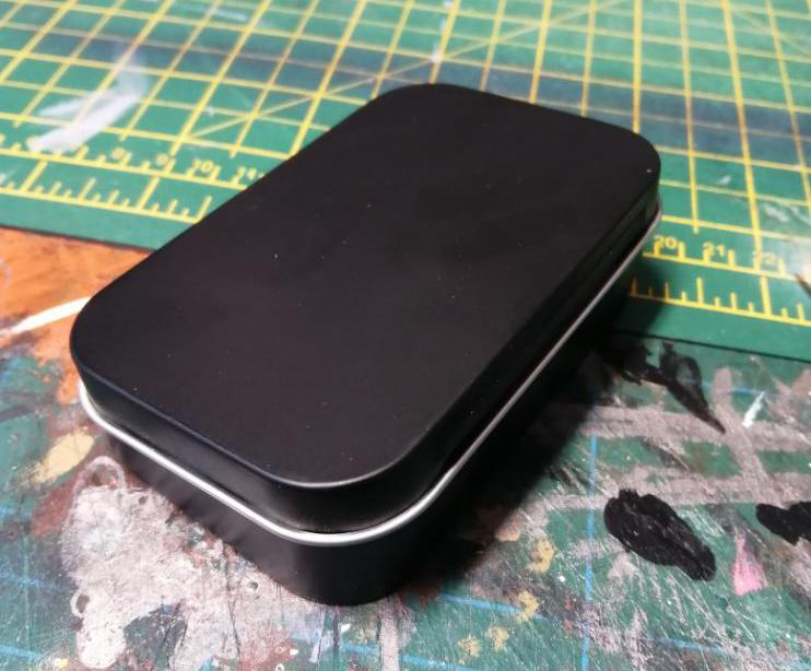
In order to extend my profile further I have produced promotion packs which I will be sending to potential clients. I wanted to produce something unique and memorable so as to rise to the top of the pile. Here I used baking tins and easily and cheaply sourced materials to create a promo pack in a tin.

This pack not only highlights my illustrative skills but also my maker and design skills as well as my unique creative personality. Within the pack I have products in the form of badges, booklets, prints, a flip book and postcards. This pack Is a tactile experience and is unlike any packs I have seen during my research into this promotional method.

I will need to be proactive in my professional pursuits and initiate contact with game and publishing studios, by sending promotional packs and portfolios to the relevant art directors. Studios such as Ubisoft, Rockstar and Blizzard will be my main targets as well as science based publications such as BBC focus, New Scientist and Nature.

Another invaluable self promotion tool has been the setting up of my website. This has been a great way to showcase and sell prints of my work, as well as a location for clients to contact me for commissions and business opportunities.

To make the selling of my prints a smoother process I have invested in a high quality printer which allows total control over my prints. I am able to get my orders sent to my customers usually on the same day as they order them.

Having this printer has also opened up a side business where I print work for other artists. This has generated a small but steady income stream which is helping to pay for the equipments so its a win win.

Another area I will continue to dedicate time to is entering illustration competitions such as the AOI world illustration Awards, the Cheltenham Illustration awards, V&A illustration Awards as well as the various Categories available from D & AD.

The entering of these competitions is an invaluable opportunity for both self progression as well as the potential exposure it can bring within the industry. To become successful at this I will need to continue my growth as a creative by remaining aware of my weaknesses as well as utilising my strengths as well as using the skills I have gained in using reflective cycles and self analylisis.

This way I will be able to expand my knowledge and skill base and become more marketable within the industry.

Looking back over the last three years I see the growth and maturity in my ability to create a higher standard of work. I also now have a deeper and richer understanding of the creative industry as a whole. With these enhanced skills I feel confident I will be able to continue to grow as and artist and make my way within the industry. All my life I have wanted to use my artistic and creative interests as more than just a hobby and I now look forward to my new career as a professional illustrator.

Promo Pack MK2

Although I am very happy with how professional the promo packs I made in my previous post have turned out, I feel that these are too time consuming and expensive to send out en mass to clients, which could hamper my potential exposure. To combat this I will make a second promo pack containing the same elements but at a far reduced production time and cost. This will allow me to send my ‘premium’ pack to my most favoured clients and my ‘standard’ packs to a wider market

As I already have all the internal elements for this additional pack I just need to create the packaging. Most of the time and cost spent creating the ‘premium’ pack was in the various tins, magnets, straps and drilling for hinges. To resolve this I will now produce a more compact envelope style pack which uses fewer steps and processes to create.

Using a single sheet of black paper stock I create an envelope slightly larger than my CV size. On the flap of this I round off the corners for a neater look. Next I uses a sheet of brown card and make a concertina fold down each edge. This allows me to glue in two dividing sections using blue card to match the colour theme. I then glue this to the black envelope Next I make a pocket for the badge. I will only use one badge in each of these packs so the pocket can be small. I make this using a section of black, and a section of brown card laid across each other. Again I round the corners for a neater look and then glue this to the brown card pockets. To add pattern I print a strip of the iso city pattern and glue it in a strip around the envelope. I use the same strapping method from my ‘premium’ pack to close everything up, using a magnetic clasp on the envelope flap and the material branded section stuck to the webbing. This keeps everything tightly bound and adds a high quality feel to the whole package.

This new pack contains around 80% of the internal products as my ‘premium’ pack. I was able to produce 17 of these packs in the same time as 7 of the ‘premium ‘packs and at a much reduced cost of £4 each as opposed to £20. also these will be far cheaper to post. Although they do not have as much wow factor I am more than happy with how these turned out. They still have all the design elements from my research. They are still tactile and high quality. And I will be far more likely to produce these further if needed than the ‘premium versions.

Promotional Pack

Promo packs are a collection of products, information and portfolio work which can be sent to potential clients in the hope of raising my profile awareness. A good pack will need to stand out from the crowd and grab the attention of art directors and clients who will receive a high number of these packs on a regular basis, so its important stand out.

My first step in the creation of this pack was to take a trip to my local art supply and hardware stores for inspiration on materials I could use. As I knew I wanted to use a box or container for my pack I first wanted to see what was available. I was aware that the production of the pack would have a cost associated with it, and as I intended to make 10 promo pack to send to clients I needed to keep these costs within reason. As the style of work I would like to present would be my sci fi and technological aesthetic I reasoned a metal container would work well. With this in mind I first looked at metal lunch-boxes and biscuit tins However on looking at what was on offer I realised that the available products did not meet my needs as these usually either had embossed sections or where prohibitively expensive. I then happened upon the baking section and found a large selection of baking trays. These came in various sizes, where cheap and available in large quantity without any embossing. They are also light weight but sturdy which would be ideal for posting out. I purchased several depths for experimentation.

I had the idea of stacking two trays on top of each other. This worked well however the depth this created was far too deep for my needs. This would be perfect if I intended to include t shirts or bulky products like cups.

As my experimentation evolved I came to the idea of stacking two of the thinner trays and joining them with the leather working eyelets. This created a book like tin with an internal size of a4 and a depth of 2.5cm. This would allow enough internal space to add my products without them rattling around. It also had the benefit of being an easy and inexpensive size to post.

For the securing strap I came across these magnetic bag clasps. The magnets are strong enough to secure the two side of the case but come apart very easily when the strap is pulled apart. The clasps come with fixing taps which are perfect for attaching through the thin metal of the tins. This gives the easy to use and tactile experience I am looking for while being a secure and cost effective solution. I purchased 50 clasps for £10 from Amazon. The baking trays I purchased from Home Bargains for £1 each. The webbing I purchased from Ebay for £2 per meter. Total time to produce one tin with straps and clasp was 20 minutes.

I need to assemble the items I would have in my promo pack so I could work out arrangement and presentation. I already had my creative CV ready to go. I knew I wanted some collectable prints so I produced a sample pack on my own high quality home printer. Having this printer was invaluable for this experimentation stage as I was quickly able to try several iterations of size and style until I was happy with what I had. It was my intention to have these printed at the collage print suit as this would be cheaper at high quantity. The badges I was unable to produce at home so I ordered these from Awesome Merch for £25 for 60 with 3 designs. This would allow me to at 3 badges to each pack. The stickers I was also able to print at home but would have printed professionally once I was happy with the style and size.

I wanted to showcase my animation so I made this flip book. I saves my animation as 32 jpeg files and then printed these onto a single A3+ page. On my first attempt I found getting the pages in order to be difficult so on my second try I numbered each section to make assembling them easier. Also for my first attempt to bind the pages together I used standard bolts drilled through the spine on the book. This worked but looked messy. After feedback from my tutor I purchased these book binding bolts which look far better and cleaner. For the cover of the book I used the same hexagonal pattern I had used for the background of my CV as well as the same font and light blue colour pallet. This helps to create a consistent and unified product.

For my portfolio book I self printed a selection of my sci fi space ship designs to make the little book of spaceships book. Again I used the same cover design and font. I bound this book myself by clamping the pages between two wooden blocks and using hot glue to seal the pages and cover together. This is a method I seen on a book binding tutorial from from Peg and Awl (2020). This worked great however was very labour intensive. Also it was difficult to align the pages perfectly. For my final product I have used Vista print to produce these books for £32 for 30 copies. These purchased copied look far cleaner.

For the inside of the pack I wanted to add some patterned elements to the design. Here I printed my iso city illustration as it fitted with the sci fi theme as well as the black/ blue colour pallet I was going with. I glues this print to the inside of each tin. This gives the interior more character and looks more interesting as well as showcasing my work. I wanted the various elements with the pack to be presented neatly. For the prints and book created these concertina style pockets by folding and gluing high quality paper stock. To reduce costs here I found that scrap books can be inexpensive yet contain good quality paper. As an example 10 sheets of black 300×300 paper from my supply store was £10 yet the scrap book which had paper of equal quality and size but contained 40 sheets was only £6. Do the maths….Score!!!! I knew the flip book and badges I would not fit into these pockets so I sourced and purchased 20 of these tins from Amazon for £18. these are the perfect size for the items and would add an extra tactile element to the interior like little extra tins within the tin…. tin tins. The black coating also matched my aesthetic perfectly and the depth would fit snugly into my pack.

With ll the pockets, tin tins and elements sorted I now arranged then within the pack. I wanted the various elements to fold out from the main body of the pack however I encountered a problem with this. When the pack was opened the envelopes would fold out by themselves and the elements would fall out, giving a poor user experience. To resolve this I added the same magnetic clasps and webbing from the cover of the pack to each envelope and secured the straps the the faces of the pack. This secured everything neatly in place and have the added advantage of unifying the cover with the interior. The down side was this added yet more per unit cost. This cost was however small and therefore manageable.

I realised at this stage that the cover of my pack was lacking in any interest or branding. To remedy this I utilized the availability of the college laser etching workshop. I used a design from my spaces ship work to add texture to the cover. The staff in the etching workshop where at first unwilling to run this work as they had concerns about the coating on the tin damaging the lasers lenses. To get round this I sand papered the coating off and resprayed them with matt black automotive spray. I also wanted to add my branding as well as the colour theme to to cover. At first I wanted to have embroidered patches made which I could attach to the strap. These would have my branding, stephen carr art, as well as the blue colour scheme, however the production of these patches at the size I wanted would be prohibitively expensive. My solution to this was to use t-shirt printing paper to transfer my design to a plain blue t shirt I purchased for £1. I applied double sided tape to the back of this and attached the patch to the webbing. This worked great and the final result is a soft plastic like texture which is very futuristic feeling. I think this is actually a far better result than the embroidered patches would have been and at a fraction of the cost.

With this prototype now complete I was able to go into full production. The prototype took me 5 days of experimentation as everything was hand made. For my production run I decided I would be able to create a further 7 packs in one day. To accomplish this I outsourced several elements. I placed order’s for the space ship books with Vista Print. I used the college print shop to produce my art prints. I used Repro to produce my CV’s. I ordered my badges from Awesome Merch and I had the laser etching done in the college workshops. The production and assembling of the pack took longer than I anticipated at around 2 and a half days. Overall I spent around £20 per pack. I am very happy with how professional these packs have turned out. I feel I have met the outcomes of my research and have overcame the problems I had during my experimentation stage with innovative solutions in regard to both function and costs.

Creative CV

As an illustrator I will need to reach out to professionals in the industry. To aid me in this it will be vital to have a well crafted and memorable CV which breaks down my abilities, skills, experience and contact details into a visual document. This document will be the first contact I may have with potential clients so it needs to stand out from the crowd and be a memorable representation of myself and my practice.

For the main image I want to showcase my illustration style and skill level. I will re purpose this illustration of a robot. This will give a visual representation of my sci fi based aesthetic, my skill level with digital illustration as well as an insight into my personality. I also had the idea to make my CV into a user guide for said robot/Steve. This would present the information in a fun and unique third person way which will hopefully stand out. To make this image more personal to me I will replace the dome head section with a self portrait in the same style.

I have decided I will make my CV a tri folded leaflet style in the form of a users guide. This is something I have not seen done during my research so I feel it will be original and stand out from the pack. To make this work I have orientated the page landscape and divided the page into 3 sections. The side pages have been dedicated to text information while the centre page is all visual information. My introduction is done in the style of an advertisement for the CyberSteve and lists the my attributes as the robots functions. I feel this is a fun and unique way to introduce myself and shows my fun and sci-fi obsessed personality. I have used a hexagonal element throughout the design as my visual language which helps to tie all the elements together. I have also tried to keep my main colour pallet limited to three main colours as per my research with the exception being the logos for various software as these logos are well known and will be easier to assimilate the information if kept as is. As this will be a booklet I have designed the back cover in the same style and presented it as a users manual. Again I have used the same colour theme and hexagonal background pattern for continuity.

Building a Better Website

For the last 3 years I have had an online portfolio which I have had hosted on ArtStation. This has served my needs well up to this point but as I get closer to the point where I want to be seen as a professional illustrator, I feel I need a more professional set up for my website. Another driving force to this is that I want to set up an online store to sell my art prints.

ArtStation interface
ArtStation portfolio site

During a recent talk with a representative from the AOL it was suggested that most professionals in the field use hosting sites such as Squarespace, as this offers a wide range of services needed to present a crisp experience to the aspiring and professional illustrator.

I have used many different brandings for myself over the years. My first was simply Svencar as this was the very first email address ever had. After that I went by the name Sventendo. I was doing a lot of computer game inspired artwork at the time so the name fit my style of the time. Now I am going for a more professional appeal I have all my social media and email addresses under the self explanatory Stephen Carr Art. I have owned the domains stephencarrart.com and stephencarrart.uk for the last 2 years. This domain is perfect for my needs going forward and presents me as a more serious and focused artist which will have appeal to potential clients.

Having set up an account on Square space I needed to transfer my domain across from my old site to this new one. This is a simple task and only required me to request an unlocking code from my old hosing service. This code was then given to my Sqarespace account and the transfer happened within 48 hours. On setting up my account I was presented with a wide variety of options for layout and style. I have decided to go with a super simple and clean style with a white background and elegant simply font. This will allow my artwork to be the main focus and not be buried under to much clutter. At first I found use of the site a little clunky and not very intuitive however there are a large amount of inbuilt tutorials to follow which quickly got me caught up on the functionality. As I Stated, one reason for this change was that I wanted to set up an online shop. There are several account packages based around commerce and finding the right one to fit my needs was easy enough. The package for a years subscription for £230 fitted my needs. This allows me a low level of sales but if I find I am selling lots of prints I can upgrade this easily which will allow for less commission going to Squarespace.

Squarspace Interface

Next I needed to upload my work which was simple and quick compared to my previous experience of uploading to my old site. Squarespace has a huge variety of commerce options available and I was able to set up several purchasing options for my prints. There is even built in stock tracking and finance managing functions as well as site traffic analytics to help with my management of the site.

Finally I needed to link my other social media accounts into my new website. Again this was simple and easy. once this was done I could launch my site and my shop to the world and sit back while the orders came rolling in………….

….Hopefully.

AOI Business Masterclass

Recently I was invited to a talk hosted by the membership director of the AOI, Rachel Hill. This talk was focused on helping information and advice to help me become a successful illustrator.

The fist section covered was the creation and presentation of a professional portfolio. This outlined the importance of having a place where my work would be showcased to potential clients in its best possible way. The advice was to make sure my best work was the first thing that would be seen on my site and that this work was also the kind of thing I wanted to continue to create. Another aspect was to have a custom domain name and matching email and social media links. This was great to hear as I already have my domain name as stephencarrart.com as well as email and social accounts in the same. This section of the talk gave me a confidence boost as almost all the advice given fitted in with what I have already set up. It was great to hear I was already doing the right things as far as my online portfolio was concerned. One place where I could aim to do better though was in having a more consistent style. The advice was that art directors would be put off if there are too many conflicting styles to look at. As I have many different approaches to my work I also have a variety of styles. This can be both a blessing and a curse and the advise for this can be conflicting at times.

The talk then went on to cover the social media aspect of self promotion. This highlighter the benefits and importance of having a strong online presents. The key takeaway here were to keep interactions and post professional and to use the full range of functions the different platforms offer. Again I was happy to hear that I am already doing the correct things as far as this advice was concerned. I currently have several social media accounts which are linked, meaning any post to each platform are shared across all the platforms. Also I don’t use any of my social media for personal use meaning I can easily keep it all professional. One area I have not looked into yet is linkedin. I do have a linked in account but have never used this for my illustration information. This is something I will include into my network. The advice on how to protect my work online was also very informative and useful as I currently do not protect my work very well. Again this is something I will start to do going forward by adding meta date and file names.

How to find clients was covered next and this was very informative. Here we covered the creation of a dream client list and how/ where to find the information needed to contact them. Several resources for finding client information were presented such as the AOI publications however I feel that subscribing to a contact website would be a better fit for me as the information would be constantly updated whereas a publication will go out of date quickly. The advice on how to contact clients covered what to include in emails as well as mailers.

As a professional illustrator I will need to manage my finances and be responsible for keeping track of expenditure. This is important for self assessment and taxes. The talk covered how to register as a sole trader and how much could be earned before having to pay tax. It also gave advice on how much commission value to keep back for tax. Also the importance of keeping receipts for expenditure, equipment and supplies associated with my illustration practice. Also apps that can help keep track of all these where also covered.

Licensing and earnings were covered next. This part covered how to licence my work out to clients and how to arrange a fee for creating commission work. This gave advice on determining fees based on the clients size, where the work would be seen, duration and areas of use and how many illustrations would be needed. The use of the AOI fee calculator was covered which is a very useful tool that I have used in the past to calculate my commission fees. Also included in this section was advice on how to negotiate with clients as well as fee erosion tactics. Getting into the mindset of a joint enterprise rather than feeling indebted to the client is key to getting a fair value for your work. Realising that negotiation is a process rather than a battle is also a good attitude to adopt.

Following on from this was advice on setting the terms of contracts and what information needs to be included to make sure both the clients and my own interests are protected. The advice was mainly focused on getting everything in writing and to make sure to add the AOI terms on each contract.

I recently went through the process of negotiating a contract and licence agreement with a client and I was very happy to be validated by this talk in my approach to this as everything I did during that commission fitted into the advice given here.

Finally the talk covered annual earnings within the sector and how we can set earning goals. Its is important to have earning goals in order to continue as a full time illustrator.

Here it was advised that it can take several years to get to the level of being able to make a living from this and the importance of having different earning streams connected to this such as running workshops or perhaps having a second job. How much an illustrator can expect to earn in each sector was covered and how to have a career that cover’s several sectors.

As a closing task there was advice on 3 things to do.

First was to research clients I want to work with and to be more targeted.

Being business savvy was also a key area to gain knowledge in and I t was advised to put a couple af days a week to working on my business plan. Lastly taking control of my career in the most important element to success.

Overall this talk was very helpful in both supplying new insight into the freelance illustration sector and well as being a confidence boost in validating the actions I have already taken in my practice. I already have my website and web store set up with custom domain names and connected social media accounts. During recent commission work I have successfully negotiated a contract and licensing agreement that suited both myself as well as my client and I am reaching out to build my networks. The main take away from this talk I will now start working on is building a client wish list and developing a more focused style. Setting myself some personal projects to achieve this will be key to streamlining my visual language and style.

More instargram shenanigans

For the last few weeks I have taken a slightly different direction with my instagram page and techniques for having a more regular daily post schedule. Previously I was focusing on turning my page into a Synthwave styled aesthetic. This was working great and I was getting lots of new followers however It was taking me several hours to create each post. The illustrations I was producing were good but the turn out was just too time consuming to allow me to post content daily. information gained from my research into raising my instagram profile suggested tat posing often and consistently is very important. articles from sites such as Social buddy advise ” The more frequently you post on Instagram, the more likes you’ll receive. Posting more increases engagement and also earns you more followers faster. If you are looking to grow your page, it’s important you post frequently and consistently to keep your loyal audience engaged with great content and keep your brand front of mind (Social Buddy 2020)

Also YouTubers such as Mike Sherrard advise to “post as often as you can consistently commit to (Sherrard M 2020).

Illustrations such as the one below would take long to be able to produce daily posts.

own work 2020

To combat this I wanted to start producing illustrations that would still be high quality and engaging to new and existing followers but at the same time be quick to produce. I came up with the idea of creating modular drawings that could be manipulated and combined digitally to create new work. Also I wanted to be able to post the same image several times but with each subsequent post being an updated version. This way my followers could see a progression of work and hopefully become more engaged with my work.

I started by producing ink drawing of side profile space ships. I drew several ship bodies, engine mounts and extra bits. Using these assets along with others I was able to quickly make many variations of ships.

Using this technique I was able to produce over 100 unique ships in under 10 hours of work. That’s over 3 months of daily posts in just one days worth of working. This allows me to not only post my work daily but frees up a lot of my time to work on developing variations on the same posts.

My next step was to work on how I would present the work in my posts. I did not want it to seem like I had created these drawings using the methods I used as I felt some of my followers might see this as cheating… maybe it is. I overcame this by presenting my work as if it had all been produced by hand in a sketchbook format.

I took photos of a blank sketchbook page with some pens arranged around the outskirts. This will give the impression of them being hand crafted drawings… which they are… kind of.

I then used photoshop to add the manipulated images to the photos, using the transform tool to match the viewing angle. I then adjusted adjustment layer to make the drawings blend with the photos. The results below are the final product. Again i was able to convert dozens of images into this format quickly and the results look hand drawn and are presented in a professional looking format.

The feedback on these illustrations has been very positive and has resulted in a sharp increase in follower numbers.

Using the method of adding a digital image to a photo of a sketchbook gave me the idea to manipulate some of my other works in a similar way. The hand made aesthetic was proving to be popular with my audience so I experimented with this technique.

below is an example of a digital illustration I produced for my synthwave aesthetic which I have manipulated to look link it has been painted on a canvas. I took photo’s of a blank canvas on a wall and added the digital image. I also used photoshop filters to add a canvas texture to the digital illustration to add to the effect.

own work 2020

I will continue to experiment with this method as the feedback has been very positive as to this kind of work. It allows my to present my illustrations in many formats quickly and easily.

How Often Should You Post On Instagram? (2020) Social Buddy. Available at https://socialbuddy.com/how-often-should-you-post-on-instagram/#:~:text=How%20Often%20Should%20you%20Post%3F%20Aim%20to%20post,follow%2C%20it%20may%20not%20work%20best%20for%20you. [accessed August 2020]

Sherrard M (2020) How Often Should You Post on Instagram in 2021? YouTube Video available at https://www.youtube.com/watch?v=H9dmy06-y1A

To print or not to print

I have been recently getting more requests for prints of my work. This is mainly due to my continued efforts to boost my social media network and my focused work output. Up until recently whenever I get a request for a print I would order copies from online print company One Vision Printing. They offer custom printings sizes and a large selection of paper types for fine art. This service has been useful however it can be quite expensive. For a 300x300mm print of photo rag it can be £10 plus £4 postage. If I sell my print for £20 then that is only £6 profit on each print. With this in mind I have been researching into the possibility of printing my own work. Having the ability to print work myself would have a number of benefits. First I would be able to turn my orders around quickly. Ordering online currently takes around 7 days from order to delivery however if I print my own work I could have my work on its way to my customer within hours of receiving the order. Another benefit would be the cost. My initial outlay would be high as professional grade printers able to produce high quality art prints aint cheap however once the costs of the printer had been recuperated my costs would drastically reduce and my profits would go up.

So I did my research by reading online reviews from sources such as tech radar and pc mag to get a feel of which printers would suit my needs. One tech radar review caught my eye saying “The Canon Pixma Pro-200 is a monster of a photo printer. Its 8-ink dye system called ChromaLife 200+ provides excellent colour accuracy and a wide range of colours for vivid prints that you would want to hang in a museum. Its large format allows you to print up to 13” x 19” prints and, with its two paper trays, you’re able to cover just about any paper stock you can think of, making this printer incredibly versatile” (Hill J 2021). This printer seemed to fit the bill however I wanted to fully research this line of printers before making a final and pricy purchase. It was during this additional research that I found the YouTube channel by Keith Cooper, a professional photographer and owner of a print studio. He has several highly informative review and comparison videos on his channel and I found a one that compared the various models of canon prograph printers. In this video he covers every aspect of the use and running costs of each printer in the line side by side which is perfect for helping me decide. He explains that the prograph 200 and 300 are almost identical in their outside however the main difference comes from the type of ink system they each use. Keith advises that the pro 200 uses a dye bases system and that the 300 uses a pigment based system. He describes the difference as ” the pigment based system allows for a higher colour variation and longevity to prints. The pigment ink degrades less over time and it is claimed that it will last for over 200 years without fading. making them an ideal choice for gallery and art print application” (Kevin Cooper 2021).

with this information I decided on the Canon Image prograph 300 A3+ printer. This is a mid level printer which uses pigment ink rather than dye based ink. It also offers A3+ borderless printing which will allow me to offer larger prints to my customers.

Having a good quality printer is no use unless you use good quality paper and this is a bit of a mind field as there are hundreds of options. For my research into this I again read several articles from the Canon site as well as independents like Photo Specialists and Keith Cooper. I learned that it is usually best to use paper manufactured by the same company who made the printer, in this case Canon. In one of Keith’s videos for example he advises that “the printer will have been tasted and optimised on their own paper and this will give the best results” (Keith Cooper 2021). Taking this advice I ordered several packs of A3+ paper from canon. I ordered a smooth fine art paper, an etched paper and a pearl semi gloss paper so I could offer my customers a wider range of products. I also ordered a test pack from canon which contains samples of all the other photo papers they offer. this will allow me to run some experiments with my printing. The biggest downside to using original manufacturer products (omp) is the price…

Paper is expensive stuff!!!

Pablo Escobar was selling the wrong kind of white stuff I can tell you.

A pack of 25 sheets of high quality A3+ Canon art paper can run to over £100. Gulp. That’s £4 a sheet… Double gulp. Looking around there a plenty of alternative paper suppliers who offer wider ranges of paper types at lowed prises. But is the paper any good? Rather than spending a ton of dosh finding out I have ordered several test packs from companies such as Marrutt and Permajet. Like Canon’s, these test packs contain a4 sample sheets of all the art papers they offer. My hope is to get my costs low enough as to be able to offer my work at a price that people will be happy to pay as well as me making first, my initial outlay for the printer back, and second, a tidy profit going forwards.

So there you go.

All good yeah.

Well… no.

I’m still waiting for my printer to be delivered.

Due to a worldwide case of the sniffles there is a massive shortage of home office equipment at the moment as everyone is now working from home. I did manage to fine and order the printer from the Netherlands though so that’s all good yeah….

well…. no.

Due to a political situation where Great Britain doesn’t want to play with Europe anymore its taking a lot longer to get my printer than I had hoped.

Something to do with customs.

Maybe I should give Pablo a call and see if he can help out.

Anyway just though Id let you know what was going on. Once I get my printer and have a play with it ill let you know how its going.

See you later buddy.

Choosing between the Canon PRO-200 or PRO-300 13″ desktop photo printers (2021) Youtube video. Available at www.youtube.com/watch?=fFmjcPK7KRw [accessed Jan 2021]

Choosing the best paper for printing your own photos (2020) YouTube video. Available at http://www.youtube.com/watch?v=qubhsMiShk8 [accessed Jan 2020]

Hill J (2021) Best photo printer 2021: the best printers for your digital photos. Available at https://www.techradar.com/news/best-photo-printer [accessed Jan 2021]

Design philosophies

My design philosophies

Go with the gut

When I am creating my work I usually have a strong idea of what I want to create. This idea can come from a book I am reading, a movie I have watched, music I am listening to or something I see or hear when out on my travels. The source of the initial subject can be as varied as the available possibilities and iv learned to trust in my initial concept. If I over think the meaning and the function of the final outcome, the final outcome will not be what I envisioned at the outset and will therefore not be honest to myself. Often I do not have to ability to bring into words or even sometimes logical thought the reason “why” and if I try to convert it into a concious stream I will fine that the words I do find to explain will inevitably change the thought. To be honest to myself and to my work I need to go with

my gut and not get side lined by the perceived conventional approach.

Research the visuals but hold true to the plan

Researching common threads within my visual tapestry and exploring the content that has helped form my inner visual library is an important step in the process of developing my outputs, however its vital to me to allow the research to aid rather than control the course of my production. It is too easy to be distracted by the research and changing the course of a project or an in action development. This is why I must always trust in and stick to my own concept realisation.

Trust in my time earned skills

During the conceptual and developmental stages of my practice I rely heavily on my traditional rendering skills. This allows me to quickly and confidently transfer thought into action without creating the barriers to creativity that unfamiliar and cumbersome processes introduce. Using my traditional skill I can quickly iterate my concepts in a fluid and natural cognitive process.  

Hiding detail in the details

Within my work I always want to add a hidden element. This can be in the form of an idea, a shape, a puzzle to be solved or an Easter egg. When someone views my work I always want them to not see the would picture, so to speak, on the first viewing. Even if the hidden element is only visible to myself and invisible to the viewer it is still important to my final realisation to add a cherry on top. This keeps the work relevant and fresh and is vital to keeping me interested and driven to the final goal.  

Make what you love, love what you make

To maintain a productive and efficient work flow it is important to me to enjoy what I am doing. Choosing projects I can engage with on a personal level allows me to invest a part of myself in each and every piece I create. Often it is tempting to just go will the convention and mimic the mainstream in order to make a quick quid however this always results in both a sub standard outcome and a hollow experience. Everyone can draw anything but by following my own path I will produce work that only I can produce.

not so instant instagram

Hay there how’s it going?

So for the last few months now Iv been trying to boost my online profile. As an artist and illustrator its important that people actually see the work you are making and having a strong understanding of social media platforms and tools is going to be vital to my career going forward. With that in mind I have been making a concerted effort to increase my following on instagram.

First of all I read a ton of articles from successful instagrammers (a word I just made up) such as Isla Koiru and Elise Moreau. They are both successful on the platform and have a ton of advise which I will detail below. From this research I made a plan to get my follower count up above the 10.000 mark.

Isla Koiru advises that “the first step is to stream line your instagram page so that any post you made will feed to your other social media accounts. (Koiru I 2020). This way I would be able to maximise my exposure while only managing one platform. I linked my Instagram to my Facebook and Twitter accounts. I also linked my website to my social media accounts so that anyone coming to any of my site would be able to easily navigate to any of my other sites with ease. The next step was to bring the visual style of my instagram page into a more focused aesthetic. Up to now I had just dumped any work I created onto my page randomly and had several hundred “junk” images cluttering up the place. I trimmed out 80% of these images and kept only the work I wanted to use to showcase my style. I also grouped together similar work so the page was ordered and looked professional.

Elise Moreau advises in her blog that my next step should be to “employe the Follow Unfollow method to boost your numbers. The follow/ unfollow method works like this- first you need to find the accounts who create contents that fits with your aesthetic but who has less then 2000 followers. Then follow everyone who follows those accounts. After one week go back and see how many of those people have followed you back and how many have not” Moreau Using a secondary app I then unfollow all those who have not followed me, as well as those who have followed me but who have not posted anything to their own accounts in the last week. This process is repeated every day and works better if done just after I have posted new content and at peak times. Instagram rightly frowns on this method as it is just harvesting accounts rather than building strong personal networks however its a method that works to build an account in its early stages and is used by the experts.

I started by targeting accounts that revolved around the Synthwave/ Vaprowave aesthetic as I intended to create more work based on this theme. This allowed my to make new daily posts to my account. By targeting my actions and streamlining my work I was able to increase my following from less than 100 to over 1000 in less than a month. I have been getting Hundreds of comments on my post and I have been getting more traffic to my website. Instagram comes with powerful analytic tools to track the details of followers such as location, age, gender and engagement. This information has been useful in informing me when to post my work.

Getting a better understanding of social media has been a rewarding experiment and something I will continue to work on. The only draw back is it takes a lot of work to maintain and needs daily attention. To get the payback from this I will need to keep increasing my numbers into the many thousands. This way I will be more appealing to potential clients who would want to use my (hopefully) popular work in their products.

Design a site like this with WordPress.com
Get started